When we design a web-page, the first thing we do is set the layout for the page. These day’s every website is dynamic, which mean the data which is shown on the webpage is saved at some database and according to the user request, the appropriate data displayed on the web page. When we set a layout for a page, it helps us organize the webpage content according to the user display. Defining a proper layout of the web-page is also very important for creating a responsive web-page.
CSS Website Layout
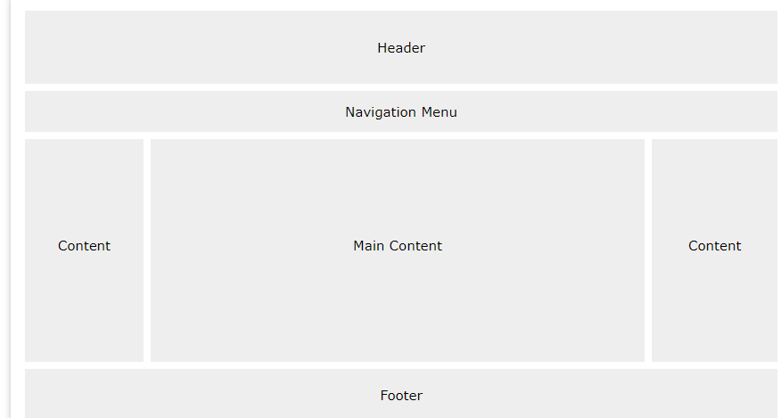
When we design the Web-page layout, there are 4 major components we need to set.
- Header
- Navigation Menu
- Content
- Footer
[caption id="attachment_7058" align="aligncenter" width="876"]

Web Page Layout[/caption] You can design your web-page according to your vision; however, the structure we have mentioned above is the most common one.
Header
In HTML5 we have a dedicated <header> element to represent the header of the web-page, before HTML5 we have to use a div tag with class name header. Using the <header> element, we can define how should our webpage header should look like and what elements it should contain.
Example
<!DOCTYPE html>
<html lang="en">
    <head>
        <meta charset="utf-8">
        <meta name="viewport" content="width=device-width, initial-scale=1">
        <style>
           /* Style the header */
             header {
              background-color: grey;
              padding: 20px;
              text-align: center;
                }
        </style>
    </head>
    <body>
        <header>
          <h1> Header of the Page</h1>
        </header>
    </body>
</html>
Navigation Bar
The navigation bar generally comes after the <header> element, and it contains a list of major links, so the user can easily jump from one web-page to another. In HTML5, we have a dedicated <nav> element to represent or create a navigation bar.
Example CSS
           /* Style the navbar */
             nav {
                  overflow: hidden;
                  background-color: black;
              }

           /* Style the navbar <a> elements*/
              nav a
              {
                  float:left;
                  display: block;
                  color: white;
                  text-align: center;
                  padding: 10px 14px;
                  text-decoration: none;
              }
           /* When user hover over the navbar links*/
              nav a:hover{
                color: black;
                background-color: white;
              }
HTML
  <nav>
    <a href="#">Home</a>
    <a href="#">Blog</a>
    <a href="#">About Us</a>
  </nav>
Content
The content of the page represents the data, what that page is all about. The content section of the page can be divided into multiple columns. And the column representation can be varying from browser display size. The most common columns of a web-page on various devices.
- 1 Column (for mobiles)
- 2 columns (for tablets)
- 3 columns (for desktop)
Example CSS
.left_column {
    float: left;
    width: 15%;
    padding: 15px;
    background-color: lightblue;
    border: 1px solid black;
    box-sizing: border-box;
   }

.main_column {
    float: left;
    width: 70%;
    padding: 15px;
    background-color: lightblue;
    border: 1px solid black;
    box-sizing: border-box;
    }

.right_column {
    float: left;
    width: 15%;
    padding: 15px;
    background-color: lightblue;
    border: 1px solid black;
    box-sizing: border-box;
    }
HTML
<div class="row">
    <div class="left_column"> Left Column</div>
    <div class="main_column"> Main Column... The main content of the data will go here</div>
    <div class="right_column"> Right Column</div>
</div>
Footer
The footer contains all the data that is present at the bottom of the web-page. Generally, footer use to show data like About us, Email, Address, Copyright mark, Term and condition, etc. In HTML 5 we have <footer> element to define the footer of a web page.
Example CSS
footer {
    background-color: grey;
    padding: 20px;
    text-align: center;
    }
HTML
<footer>
    <h1> Footer of the Page</h1>
</footer>
Summary
- It is essential to design a web-page using pen and paper before writing the CSS and HTML code.
- When we design a layout of the web-page, we need to define 4 major components header, navbar, content, and footer.
- In HTML5 we have dedicated elements for header, footer and navbar.
- Instead of using <div> element for the content it would be a better choice to use <article> or <section> elements.